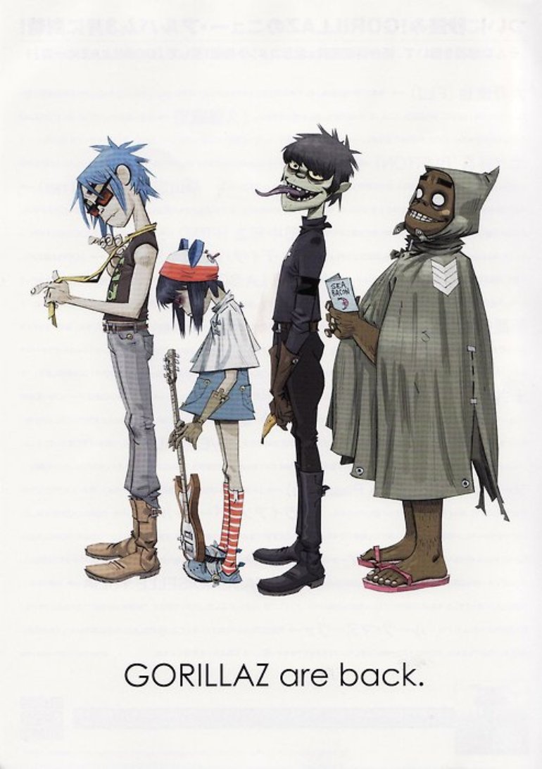
KidRobot - y'know, those funky little robot toys you see lining the glassy LED lit shelves of every high-end comic book shop. If you even remotely enjoy what I'll affectionately refer to as "weirdo media", you've almost certainly ran across, or might even even own, one of their products; from Futurama minis, to Beetlejuice keychains, to Chucky MadBalls, they've got their pop culture bases nice and covered.
A sucker for the iconic, alternative, and slightly disturbed, KidRobot naturally teamed up with Gorillaz during their Demon Days (also known to us geeks as "Phase Two") era to produce a few rounds of newly themed toys, based on the cartoon group's grunge change of image... just in case the title didn't clue you in. The figures have even gone on to be featured in a number of the band's music videos, such as their ironic spotlight in the environmentalist jam Some Kind of Nature, or the heavily modified puppet versions seen in We Got the Power. I can't believe we never got a proper reissue of that Clint Eastwood-y Murdoc.
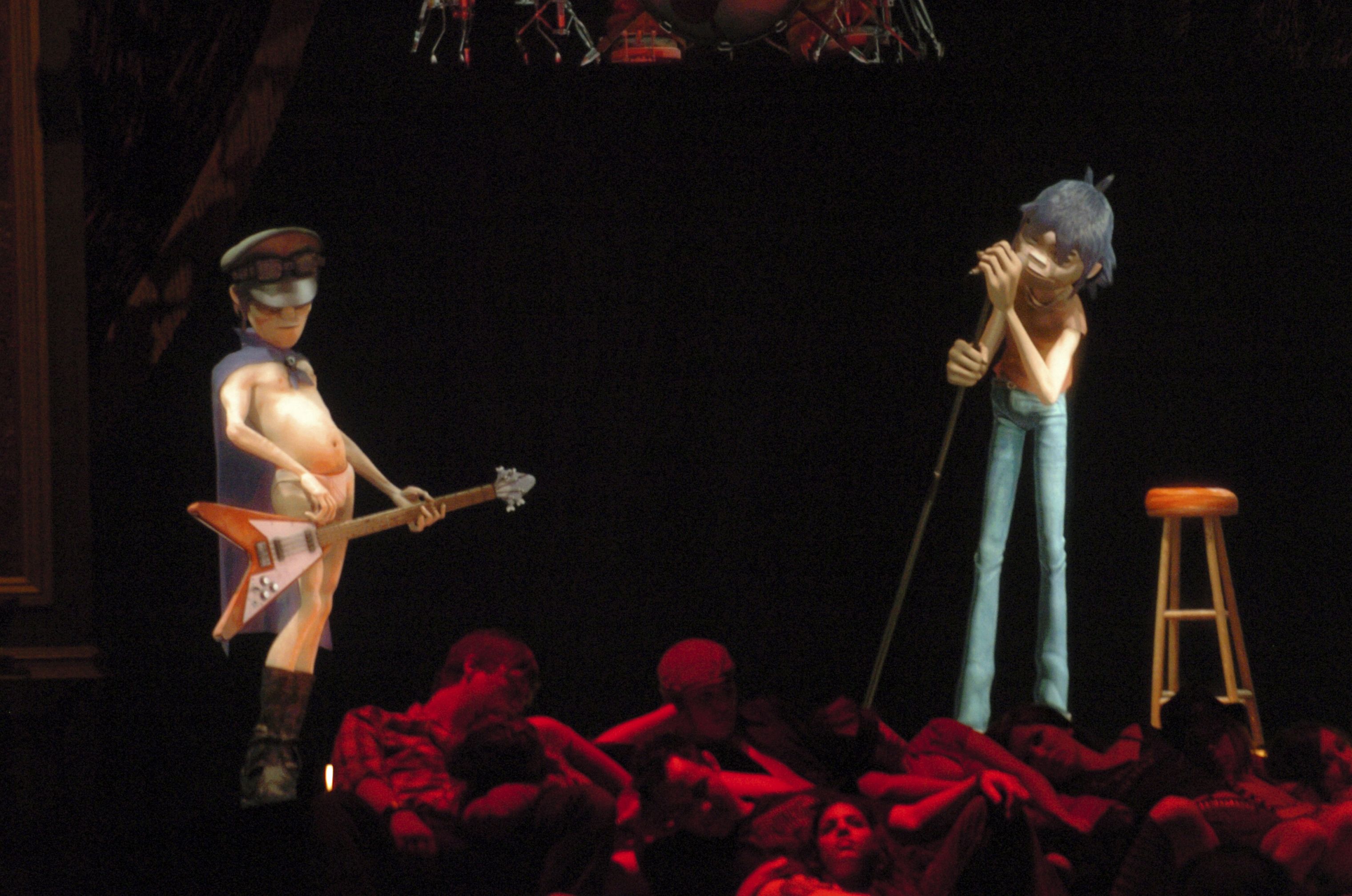
Two Tone Noodle and Murdoc in Some Kind of Nature
I summed up the band's tumultuous history in the wild, wild world of crappy toys in my SuperPlastic Phase Three 2-D review, but for the sake of conversation, I'll throw a little more detail about this particular wave of toys. In 2006, KidRobot released it's first set of Phase Two figures, the CYMK editions, followed soon by the White and Two Tone editions over the following year; all named in reference to their unique box designs. All three editions featured the same base sculpts, with different paint work and packaging.
I might eventually get around to reviewing the entirety of my set, but for now, let's take a look at the nightmare band's demonic founder - and I don't mean Mr. Albarn. He's an arsonist - murderer - kidnapper - "sympathizer" - and - worst of all - bassist of that creepy y2k ringtone band, Gorillaz. He gets away with it, too - why? 'Cuz he's Murdoc Fucking Niccals. The type of character who's very existence would probably be considered a fucking trainwreck today; hence why, 18 years later, he's gone full VeggieTales.
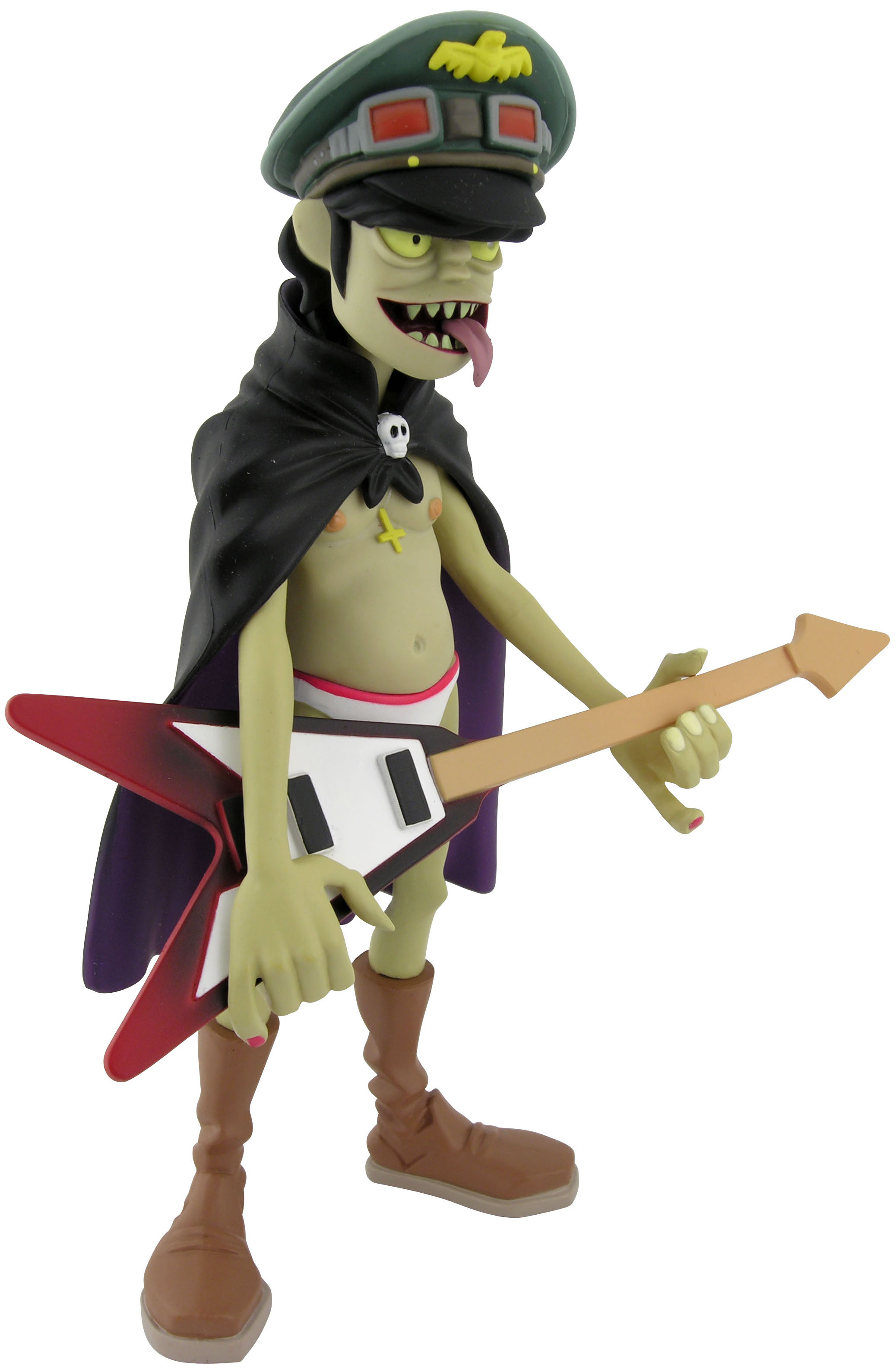
CMYK Murdoc
Now, as we start, I should mentioned I don't typically bother to talk about a figure's box; it's often very much up to one's own taste, and, to me, just isn't very interesting - nine out of ten times, you've got nothing to say. But, for once, we have to include it as part of the deal - I hate to sound elitist or whatever, but I genuinely think if you don't have these guys in box, you're only getting half of the appeal.
The wonderfully collector friendly window box excels at framing the Murdoc figure; with various pieces of Demon Days art and insignia against a slate black on all sides, it makes for a very pretty display in and of itself. As mentioned before, the box is easily openable and re-sealable, with the figure itself held in by two trays. With a setup this good, you may as well leave 'em in there - looks great.
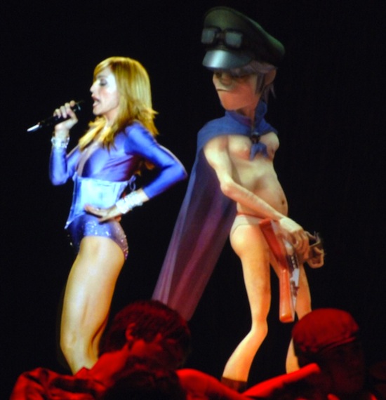
Slack jawed, heavy eyed and half naked, Murdoc's looking as inebriated as any soulless monster ought to. While I think the sculpts across all of these figures could've used more intricate detail in order to truly replicate the aesthetics of Gorillaz' artwork at the time, I also really love this figure's smooth, simplistic feel - it's totally sleek, even in it's intentionally gross-out nature. They aren't necessarily going for a 1:1 recreation of any one appearance, though it's clear to see Murdoc is heavily inspired by his 2005 CGI model; you'll recognize it from the band's trippy holographic shows... all... detailed, and... Madonna-hitting-on-y, and... "sympathetic". Ech.
Murdoc's head is very similar to the crooked mug of KidRobot's Phase One figure, with a sort of flat, thick, bug-eyed Shaggy look. In fact, it might even go back to the cancelled pre-KidRobot Gorillaz toy line by Art Asylum; the small Murdoc head keychain seen near the front of this ToyFair display looks pretty similar to the one we see here. He's not quite the more evil design Demon Days seemed to be going for; I think they could've given the likeness a bit more defined angles, specifically the chin, and outward depth - just compare it to the flawlessly sculpted Murdoc Muppet to see what I mean, and yes, that exists. Still, it isn't necessarily off-model or anything; besides some weird looking smile lines and eye bags, I think it's pretty good. He's an ugly sun'va bitch, that guy, so I can imagine he's the type to look better on camera than in person.
Somewhere between intoxicated and exhilarated, Murdoc's bass-heavy pose says ready for action; I really love the art accurate skrunkly hands, as well as his wide, bulky boots, skinnyfat bod, and punk-ass "sympathizer" hat. I especially dig his big theatrical cape, cast in soft, fabric-like rubber; really fun touch. Just like Jamie Hewlett's intricate Demon Days pictures, loads of neat little details, from seams, to skulls, are hidden throughout Murdoc's getup; though not so much so as to throw off the toy's very simplistic vibe, it's all there, but comes together in a trippy way isn't overdoing it.
Murdoc's Flying V bass, having once belonged to the devil himself, is a really awesome choice of accessory; what's a musician without his weapon? I think it could've used a lot more detailing - y'know, at least give it strings - but I get the cartoony impression they were going for. It fits really well in his gripping hands - he's got that thing locked. They could've put in just a bit more effort, but it gets the point across and still looks cool. Seals the deal.
Unfortunately the figure is very prone to toppling forward; despite his clown shoes' massive surface area, his hunched pose still makes for a pretty bad center of gravity. It doesn't help the actual construction of the figure isn't really that good; his limbs are just barely a darker color, and his head pops off so easily, you'd swear it was for some reason intentional. However, this does have the added benefit of an unintentional point of articulation, and, if you for some reason wanted, capeless mode...? Art toys and quality control just don't mix.
Something of a literal walking corpse, Murdoc's skin has ranged from a tinged grey, to some odd variant of brown, to, now, eye-burning chroma key green; as per the aforementioned mad pasty CG model - look at him, man, he's a beacon - KidRobot's gone with a sort of sickly caucasian color. There's definitely warm overtones of yellowish-green in there, and though I imagine most fans would've preferred a much more intense shade of rotten flesh, think it matches the figure's smooth aesthetic much better as-is. I take it as a solid in-between; not too normal, not too... What The Fuck. Still, you gotta wonder why they didn't try for his more iconic complexion on the White variant, especially when the Phase One figure already sported a much colder green hint.
Beyond the odd pallor, Murdoc's illness - mental, and physical - is all the more apparent by his jaundiced yellow eyes and turquoise maw of teeth. The paint work is mostly sharp and solid, with only the occasional spot of bleed or scuffing. I dig the dark gradient adding some touch of depth to his guitar, the printed silver wire holding his necklace, and the purple-on-red of his cape brings a lot of color to the figure. It's only major issue is how easily the skin tone can rub onto the very contrasting bass, and vice versa. I should also mention his teeny-tiny little pupils tend to have a sort of wonky, walleyed look, but it's severity really depends on the figure. Mine's near unbalanced, but I've seen worse.
Having once owned the White edition, as well, I think it ultimately had the better paint job of the two fully detailed figures; I really love it's inverted pupil, red pinkie nails, and darker overall color scheme. The difference is minimal, but I'd say the CYMK is overall more true to the general character, while the White feels a touch more fully envisioned and artistic by slipping in so many unique details. I've never nabbed the Two-Tone, but it's a catchy spin on the usual monochromatic redeco.
Despite my complaints, this Murdoc's one of my favorite figures; he's got just the right balance of detail and design, and is such an eye-catching shocker of a toy, you gotta track down at least one of the bunch. It ain't too common to come by such a loudly satanic, "sympathetic", and sexually sickening toy like this - he's got his small laundry list of issues - that much you can tell just by glancing at 'em - but if you dig the character, the art, or even just the band, he's a really wicked piece.
McFarlane's Movie Maniacs - a sorta all encompassing, kinda well done series of almost high-end collectors figures, lining the soot skinned shelves of comic book stores and flea market booths everywhere. From 1998 to 2004, the large series covered just about every horror icon relevant to your average turn of the century FYE shopper; from Ghostface, to the Terminator, to... y'know, Chucky - who's just hitched incarnation I've covered before, released with his betrothed as a two-pack alongside tonight's subject of torture; y'know, Chucky.
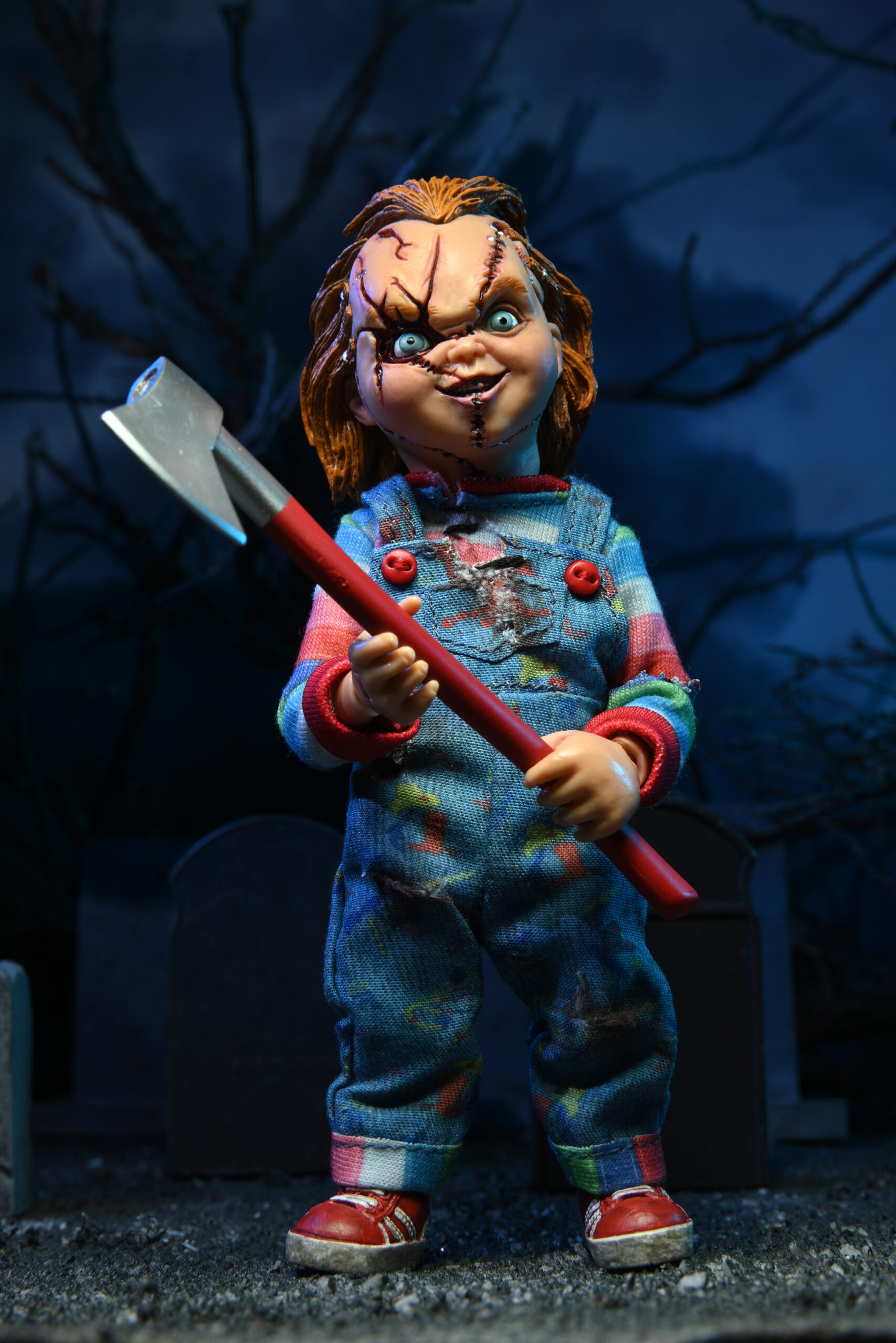
Based on his appearance in Child's Play 2, this sculpt goes for the sinister, snarling Chucky seen throughout the original Child's Play trilogy; compare his evil grin to that seen on the included poster display, and you'll see what I mean. They're almost one-to-one - really impressive. Kevin Yagher Production's original Chuckys share a pretty consistent design; between their lifelike skin, piggish face and piercing blue stare, it's absolutely the scariest and most impressive the character has looked onscreen, to this day. Many a horrorhead will fondly, or frightfully, remember this particular look, and while I'm more of a Frankensteined Chucky kind of guy (also designed by Yagher, in it's fist appearance), in his own words, a true classic never goes out of style.
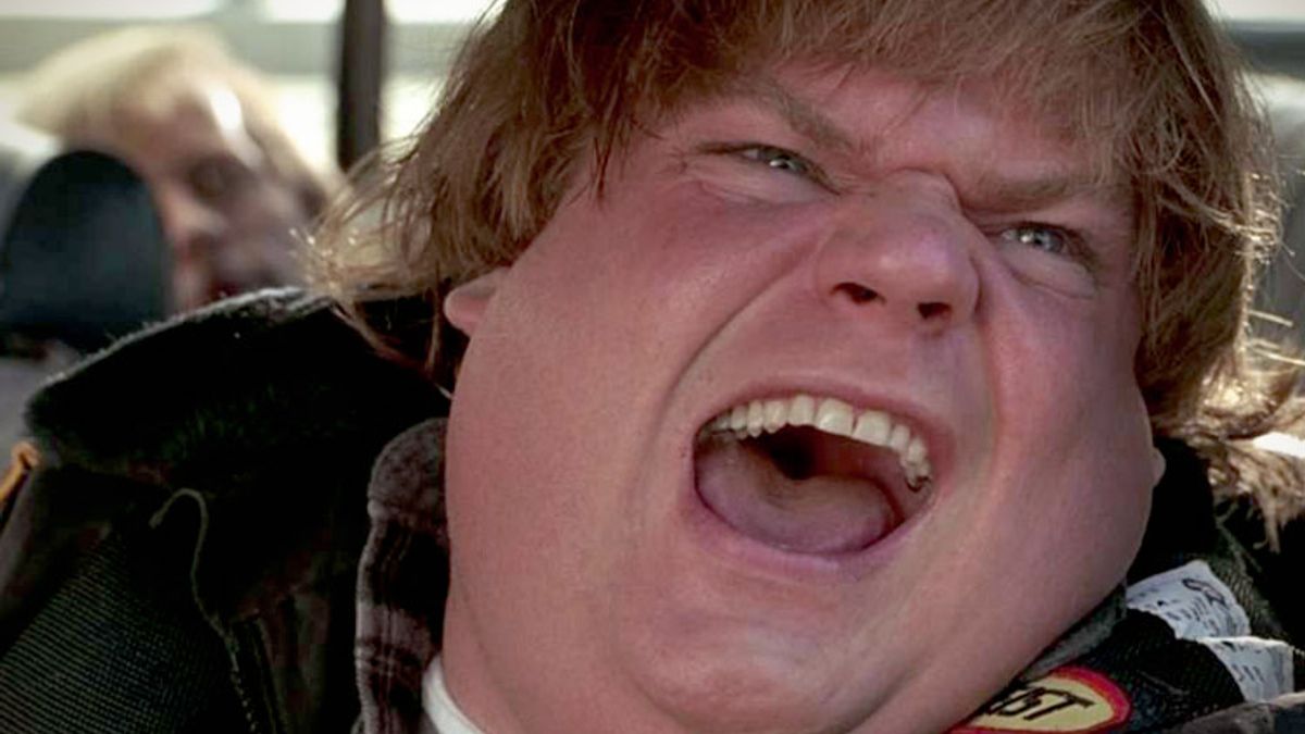
On one hand, the figure's a little chubby; looks like a chibi Chris Farley with a side of Ham Porter - however, on the other, he's pretty damn accurate to the aforementioned earlier Chucky designs, give or take a few details. I think it's all a matter of lighting; and, as an extension, paint applications. The figure's incredible in some settings... but, a bit ugly, from all but most. From one angle, his furrowed, twisted expression just leaps off the screen; from another, he's channeled that monstrous six hundred pound emo girl you vaguely remember from High School. I think stronger, more defining highlights around the eyes, larger pupils, and a warmer complexion could've helped support the strengths of his likeness; make no mistake, the look is there, it just doesn't completely stick the landing.
Speaking of looks, Chucky's got a badass Bob to beat even the most vicious of Karens. Hide your coupons, get your managers - ech, I've made myself sick. This snazzy little strangler's ginger mop, while certainly darling, ought to be a lot more crazy. While he's always had a thick red mane of manic hair, he definitely never had such a flawlessly carved cut in the original films - hell, sometimes he had less. Nowadays, it's a different story, so I can't say it's ridiculously offputting or anything - in fact, you might even say it's become on-model - but it just isn't the wild flame of hair seen in Child's Play 2. It even puts Tiffany's lumpy 'fro to shame. That's not to diss the real doll hair, though - at roughly the size of the standard Barbie, he's such a fun novelty of a figure thanks to this feature alone. Really adds to that whole killer doll aesthetic. I think it ultimately came out better on the 12" version, but really, the imperfections caused by the gimmick can be excused seeing as it really is cool thing to include. Stands out.
Going down, Chucky's body is almost exactly the same as that of the Bride variant; the obvious difference being, this version's lack of battle damage. Having yet to encounter the dreaded gigantic fucking fan which gave him his lovely lacerated look, this Chucky's nice and unassuming - no tell-tale gaping wounds or jagged tears to speak of.
Then again, the dark layer of dirt covered throughout Chucky's Good Guys garb is a sure sign this doll's seen his fair share of action; the thick, sooty resin wash really brings out his body's sculpt, and gives it that creepy, disused feel. The painted details such as his stripes, buttons and logos vary from good, to good enough, to... well, not bad, but certainly not to today's collectors standards or anything. For example, you can actually see the Good Guys logo emblazoned across Chucky's chest this time, on one hand, but on the other, the cartoony pattern dotting his overalls has been replaced by sort of impressionistic dabs of color. Does it matter? Not really. Honestly, seeing as Movie Maniacs has always aimed just right of true realism, these sort of nitpicks are non-issues - but, they're still something to note, especially if screen accuracy is what you're looking for. No toyetic footprints here, folks. With one foot slightly raised, he's sculpted in a sort of imposing half-step; not quite a lurch, more of an... evil stroll. Creepily inviting, as any lecherous, soul-stealing doll should be. It can make him a bit hard to balance in some surfaces, but usually he stands up fine. All sorts of very intricate stitches, seams and folds make his outfit look very nice, with some sections even made from a sort of soft, fabric-like rubber. While he's unfortunately very lacking in articulation, with simple swivel joints in the neck, shoulders, wrists and waist, I think you can get more than a few dynamic poses out of what you're given. He's great to just mess around with.
Chucky comes with two accessories; a knife, and a poster display. The knife is exactly the same as that of the Bride figure; it's got a sort of retro, hand-made vibe to it, nothing too realistic, but it looks good and fits snugly in his right hand. You can sort of jam it into his left hand, but it seems intended for the shape of the right. The poster display, a staple of the Maniacs series, is... whatever. I really dislike the excessively edgy skeletal nightmare border - feels like... ghetto tattoo shop and meth. It's cool to get a little poster as a memento of the film, I guess, but I would've probably preferred an actual accessory in it's place. A yard stick, a voodoo doll, a glock - guy had all sorts of memorable weapons in those first three movies. As I said in the Bride review, these poster displays are probably a little more interesting when you've got loads of these figures side by side, but I think as is it's just not appealing. Feels like filler.
Naturally, Chucky looks wicked beside the Chucky and Tiffany figures; and in the era of Chucky's neigh-endless cult of clones, they make for a pretty dope display. Surprisingly, while the Bride Chucky's torn getup is clearly modified from the clean standard, standard Chucky and Bride Chucky feature completely different base face sculpts; I would've assumed they might've use the same undamaged face to build off of, but on second thought, I suppose that might be closer to something a toy company would do today, in our digital age, rather than the still more traditional turn of the century.
Y'know, they should've done a non-possessed Good Guy doll. Would've been cool.
Movie Maniacs is a mixed bag of a line, especially through today's lens. Even some of the best examples from the series feel a little underwhelming as we've gotten so accustomed to crazy articulation, a landfills worth of accessories, and almost excessive eye for detail. Still, say what you will about Movie Maniacs, but I feel there was always a special touch of effort that inspired the very standard for collector's figures we have today. Seeing as many McFarlane alumni went on to create today's collectors lines, I guess we all have to start somewhere.
The Maniacs Chucky variety isnt't what I'd call a must-have, but they're still a pretty solid set of uncomplicated figures. I think nowadays you're better off hunting down NECA's Ultimate sets of these characters, but if you're like me, and love obscure, weird merchandise, these are your perfect friends 'till the end. Or something.
Now, if I had to choose one? I'm going with the Bride pack. You get both main villains, both looking pretty good, and, considering it's obscurity, it's not so bad on the aftermarket. The solo Chucky feels more like the figure you just need to "complete the set" - it's a little less impressive, but at the same time, he's a fun and unique figure in his own right. I know I've spent more time than any adult should, playing with this doll-but-not; frilling his hair, playing with poses - and, he's a natural in front of the camera. Besides all the serial murder, what's not to love?
Feels a little weird writing this cuz I knew an Ian. Blech.
Anywho! It's struck again - the return of the monster - everyone's favorite yearly crock - hurricane season! Yes, Ian's been looming past the sunny coasts of hellish Florida for the past few days now, and apparently it's finally made some pretty serious contact. Not that I'd know! Since, as usual, it looks like a normal day in Chicago around me. Nothing special; in fact, I'd go as far as to say it literally does not matter. But, safety first, I get it. Where it's bad, it's bad. I think.
Irma is the only recent hurricane I can remember legitimately impacting people around here; though even then, we just lost power for a few days. Good excuse to take a vacation, really - we headed up to a nice local lodge just out of town and made lemons into lemonade, Hilton style. Or some shit. It's a "boy who cried wolf" situation - the more they hype up these calm, serene thunderstorms, the less myself and others bother to care. It's even worse when you go online and see people from outside the state panicking, wishing us well, drafting our obituaries. C'mon, now.
Hurricanes can be dangerous, but y'know, so can Elephants. And I don't see us getting any compassion when the circus rolls into town.
Double standards.
Tell you the truth, the only reason I comment on all of this - besides consistency - is because I wish it'd just rain already. Like any degenerate, I love the muffled patter of a long, dreary day; its peaceful, really puts your soul in a better place. Makes your brain feel like Crumb by Locket. Lo and behold, a literal rain storm is tearing our beloved land apart, and there's not a fucking shredling of liquid dripping from Zeus' mighty cloud dong. Sad!
Oh, well. So far the only excitement has been the power going out, and my job shutting up. As such, plenty of time for my other, horribler, self-inflicted job; MidLife! Oh, how I love my little ghetto nightmare filmy.
Espencer Kennaeth Hasperian, the Sixty-Ninth
Not to mention, plenty of time for toy reviewing... man, can't believe I just said that. Gross! I have to thank Michael Crawford (not that one) A.K.A. Captain Toy for that little obsession of mine; my whole family's one big compulsive collector, so reading and learning about all sorts of lines like Palisades' Fairly Odd Parents, Playmates' World of Springfield, or any old Sideshow doll was super exciting as a kid. Still is, too! What can I say, it's a hobby.
I always thought it was cool he somehow got his hands on the mystic life-size Mike and Sulley promotional statues; I saw those things all the time at the local McDonald's in South Lyon, Michigan, super nostalgic to me. Gotta wonder where the rest of 'em wound up...
We've been closed for the storm
...Well, coming back to the ol' keyboard a day or two later - just smoked two spliffs, I forgot - the storm effectively came and went. Made for a nice little extended weekend, and the weather's just primo. I can finally breathe for the first time in weeks without breathing in a liquid gallon of humidity.
Now to prepare-panic for next week's apocalyptic doomsday event. I'll bring the sandbags.
Bride of Chucky; wicked movie, full of late 90's camp mixed with a healthy amount of earnest creativity and blood drenched fun. I love the colorful direction by Ronny Yu. You can't really knock a movie with onscreen murderdoll intercourse, can you? It was a fucking gigantic film, Chuckys and Tiffanys plastered on everything from temporary tattoos to WWE jumbotrons. They're still crankin' out stuff themed around Bride's branding, though now you're starting to see more from Seed and the TV series. Well, just in time for Season 2, I've decided to break out McFarlane's Movie Maniacs Bride of Chucky two-pack; starring, who else, but Charles Lee Ray and Tiffany Valentine. In doll form.
It's hard to put on paper exactly why these figures look good, because at face value, they ain't perfect. Sculpt wise, they're more akin to statues than action figures, which was the style at the time in the wild, wild realm of disgusting nerd memorabilia. Nowadays, you got the complete opposite; endless articulation, boatloads of accessories - hell, even the box is worth keeping. Not here; and though it's dated, I've got a soft spot for dinky, simple little toys. Less is more, or whatever.
What's with all the Simpsons references? I don't know, either.
McFarlane, as usual, rode the line somewhere between screen accuracy and caricature; there's a sort of visibly unreal, maybe even cartoony look to almost all of their retro Maniacs line, and while it can be jarring or even plain off-model, I think it was an interesting way to make toys "art". Their largely predetermined poses might limit what you're able to pull off next to hotshots like NECA or MAFEX, sure, but these perceived limitations do support the series' more unique and dynamic sculpts. Since they didn't have to worry about working in 3,214,820 pin-sized joints, they were able to focus more squarely on the look of the figures themselves - give 'em more intent, very unique on the shelf. An advantage which, I suppose, makes examples like this a bit embarrassing. These are figures that are very of their time - hell, they're older than me - so I think it's important to emphasize what made these elements of their design cool, and not just the downsides one might naturally jump to in this day and age. The technology, industry, and following of collector's items has really changed in 20~ odd years, so it's nice to look back to where the whole horror-toy-avalanche more or less started.
Chucky's gross. Covered in a grimy brownish wash, his little rubber body has suffered all sorts of abuse; from the metallic skull glinting through the seams of his skin, to the tears and gore strewn across his blood stained outfit. Pretty easy to tell this particular version of the Good Guy's seen his fair share of action. The paint work is really well done, with a good eye for accentuating the small sculpted details McFarlane was so fond of. One thing I especially like is the glossy red used to highlight his chest's jagged scar, really stands out against his matte rubber overalls. I wish his eyes were a little more centered - certain angles give him a sort of walleyed expression - but I'll live. I'll also note the details of his themed overalls aren't good, like, at all, but considering they were most likely given either blurry screenshots or some random press photos, I can't blame 'em for forgoing little tiny hats and hammers for nondescript blobs. I can't imagine many will even notice the difference - for what it's worth, though it's very blended in, the Good Guys insignia is actually there if you squint hard enough. Points for effort.
His sculpt is a little weird at first glance, but honestly, I think it's just that this particular design of Chucky is just really hard to capture; just look as these fucking demon babies. Sometimes it's the head shape, sometimes it's the hair, whatever it is, it's always tricky; especially since he may as well look different shot-to-shot in the first place, what with the whole stapled together thing going on. Really, as I mess around with the figure, I've come to really dig it's look - I can't outright list any inaccuracies, and for all intents and purposes, he's solid. At only four points of articulation, your creativity is pretty limited, but you can get a good handful of convincing poses out of the lil' strangler. His stubby legs are stuck in a foreboding half-step, reminding me of his firey final showdown in Child's Play; unfortunately, the imbalance can make him prone to toppling over, if you aren't careful.
The most striking part of the figure's likeness is his rusty orange rooted hair, emulating the doll's wild Jack Nicholson do. It's pretty matted out of the box - especially after a few decades - but give it a little fluff and he's lookin' fine. The wild bits held by miniature staples and stitches are particularly sick - they really went all out, all things considered. It's not like any other Maniacs had actual hair. Not counting further members or clones of the Ray family.
The groom's sole accessory is a crosshatched stabbin' knife, pictured above; fits perfectly in his gripping right hand, so you don't gotta worry about accidentally losing it. I always appreciate that in figures. Could've gone with a couple more little bonus features, such as a gun or the Heart of Damballa amulet, but I suppose a knife about sums him up.
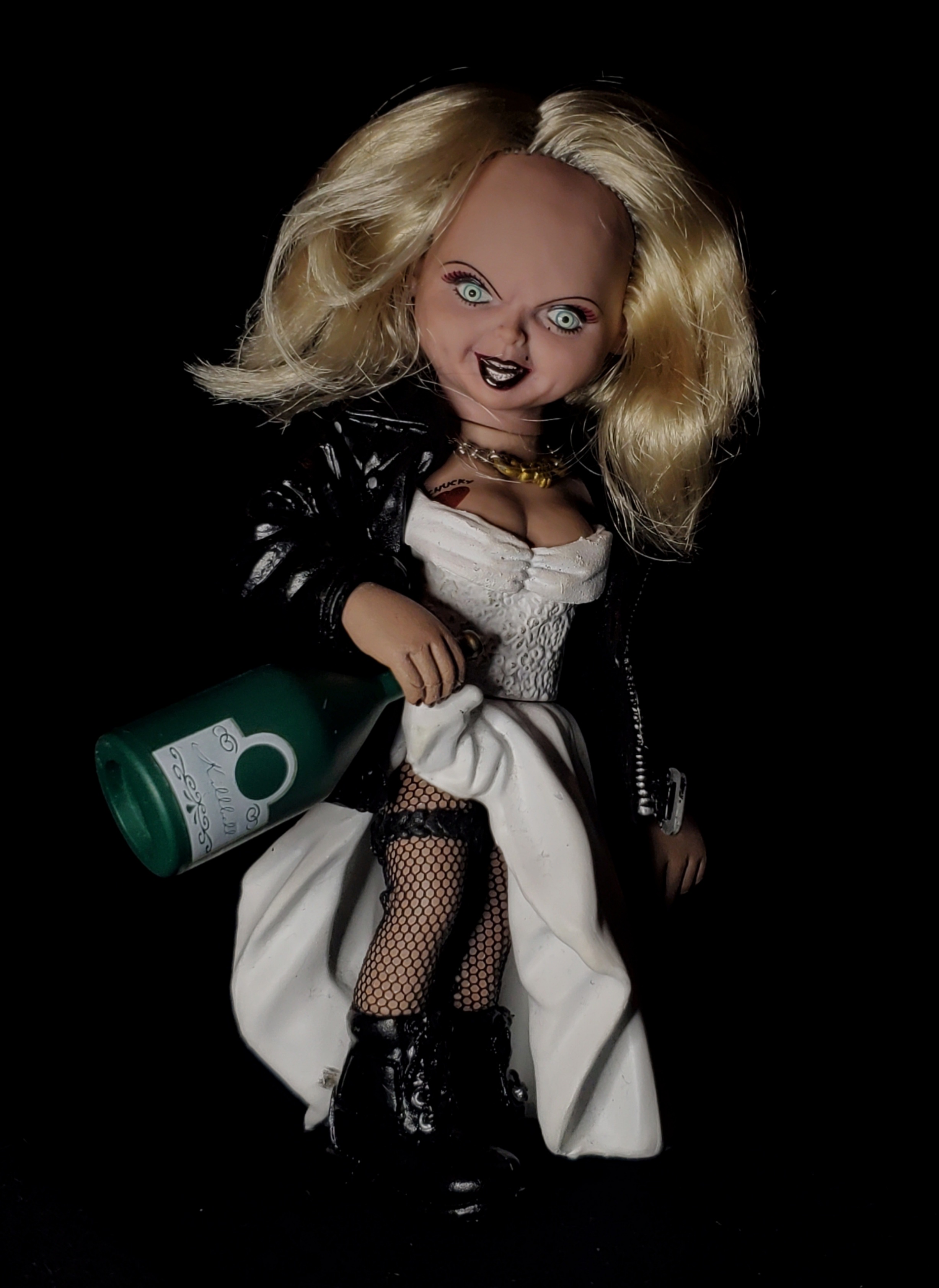
But where's the bride?! Rockin' a cool shiny faux-leather jacket, miniature cloth fishnets, chain "Tiffany" pendant, and an endearing tit-tatt, Tiffany makes a punky first impression; considering she was exclusive to this two pack, I'm impressed by the amount of detail put into her design. Hiking up her skirt with an evil smile, she's even got a wedding band wrapped around her nasty dolly thigh - I don't think that was even in the movie, far as I've seen, so you gotta appreciate the creativity. The sculpt's certainly captured Tiff's twisted personality, and though it's articulation even more limited in potential than that of her husband, I think her go-to teasing pose works cool anyway. Part of me wishes she were given a more static pose, which might've brought things together a little better and offered more creativity, but I dig the unique pose.
The wrinkles, folds and decorations of her outfit are very well done; especially her heavy jacket and goth boots, looking almost real with that aforementioned gloss. Her makeup's on point, as the kids say, complete with penciled-in beauty mark. Her tattoo looks a bit crude, though again, I assume it's a matter of what reference material was available to the team - bit of a minute detail, in 1999. That, or y'know... who cares.
Something is a little off about her head sculpt; I think it's the amount of forehead - couple acres too many, you ask me. Her expression could be better, resting in a sort of vacant downward stare - I can't tell what they were going for with the look, and it ends up giving her no real line of sight. Maybe give her less of a forward slouch, and it could've worked better. Still, it's definitely Tiff, and features the appropriate cues seen in her comparatively uglier Bride design. Tiff's sleek blonde hair is pretty clumped up and frizzy - I'm sure she'd have something to say about that. Being thicker than Chucky's, it's naturally a lot harder to stylize to your liking; you could form it to a fitting shape if you used a rubber band to hold down her 'fro a while, but that's only if you're really after movie accuracy; the general impression is certainly there, so it's no big issue.
Tiff came with two accessories; however, in reality, we'll make that one, because the other is what I refer to as "bullshit". It's a itty-bitty plastic cigarette, meant to be held in her gesturing left hand; thing is, it's so comically miniscule I didn't even realize it was in the box when I first opened these - so by the time I noticed, that thing had already hit the landfill weeks earlier. Oh well - smoking's bad, anyways, all that. Her other accessory is a big bottle of wine; used by Barbie herself to smash a gigantic ceiling mirror, dicing the Vegas victims gyrating beneath. What a bitch! The detail is pretty sub-par, but it's no deal breaker. Should've given her a heaping plate of cookies, too, or the Voodoo For Dummies manual. Me likey useless pack-ins.
The newlyweds, as with every Maniacs figure, came with a film appropriate poster; this one, of course, being Bridc of Chucky's memorable poster. Apparently it's a parody of Scream 2, but I'd bet the Chucky version's become much more recognizable. The poster itself is printed on very cardstock, attached to it's skeletal base via hot glue dabs. It's pretty low end, to the point of feeling extraneous, and the base itself is way too Tortured Souls for my taste. Blech. I would've preferred less of a branded display for the poster, or at least, one that somehow tied into the Bride motif. I guess it makes for a neat display, though, and I bet if you've got lots of these the posters look pretty neat next to each other.
These guys are really sweet, simple figures - and though they may be lacking in some departments, as Tiff would be sure to point out, they're cool for big fans and casuals alike. I really wish they made the lovely couple's creepy little semi-son, Glen, who's only actual action figure is... atrocious; sadly, the line itself came to close the same year as Glen's debut, meaning no nonbinary nightmares. There is, however, a standard Chucky themed around Child's Play 2 who came out more or less at the same time as this set. I recently scooped him up, and he's on the way, so I might just do a review to round off the company's Chucky gallery - not counting their 12" variation, because I enjoy having money.
Released in 2012 by Stunt Records and Stunt Grafx, respectively, Return to The Neverhood - this time written by not by series creator Doug TenNapel, but instead in-house Neverhood Inc. musician, Terry S. Taylor - offers an experimental, artistic, and pridefully pretentious take on the Neverhood's classic bag of tricks; with Christian theming and Play-Doh imagery to the nines, complete with beautiful new art by the aforementioned TenNapel.
However, rather than a point-and-click, a side-scroller, a laser battle, or a failed reboot, Return to The Neverhood is perhaps best described by it's tagline, "a musical fairy tale"; a brand new Neverhood inspired narrative paired with an album's worth of inky, slick, mud-covered tunes. A mixed-media daze of clay cowboys and rusting robots, showing only at the mind's eye.
As a young fan, Return to The Neverhood trudged to life at just the perfect time; I had only discovered the original series the year prior, and as far as I could tell, I was the last living evidence of a Neverhood fanbase. Then - what do you know - out of thin air, radio silence, and a third descriptive phrase, The Neverhood was back! I pre-ordered a physical copy - complete with 19 track CD, 36 page graphic novel, and beautiful thin-plastic slipcase - and, later than sooner, thanks to the horrors of media mail shipping, plunged into the hauntingly abstract tale of faith, fourth walls, and surfin'.
The old man ponders an abandoned sculpture
A bearded, heavy-footed old man - modeled lovingly after narrator, Terry S. Taylor, who opens the story with a self-aware introduction to this, his latest dream - wanders down a muddy,
wooded path; mumbling to himself as he stumbles upon an abandoned
sculpture; distant, yet familiar memories seeming to pass him by as he ponders it's familiarity.
Entranced, the
old man joyfully begins to further the forgotten sculpture. As the sun began to set, the disheveled sculpture grew to a bustling, beautiful world; dotted with buildings,
animals, landscapes, and more - as the old man began his crowning
achievements; Clay-Guy, and Mud-Gal - bringing life to the mud-clay world.
Clay-Guy awakens
Lord Lurker
Nearby, a half-mechanical, half-clay being, Lord Lurker, watches in hot silence; filled with sickened rage as he plots against the joyous creatures invading the world he thought was his alone.
As further clay residents are created, the people entitle their world The Neverhood; celebrating as the old man - or, as he comes to be known, the sculptor - offers two commandments via letter; To stay within the Neverhood; as they, themselves, were mere clay; and to only consume foods of their own growth; as any others would inflict them with a terrible illness. The people celebrate, and happily carry on.
As Clay-Guy and Mud-Gal spent their days falling deeply in love, many
Neverhood residents inevitably found themselves drawn to the dark Lord
Lurker - promised a life of further pleasures, only to be arrested and
enslaved by the cyborg upon arrival to his compound. Determined to
capture the entire population of the Neverhood, a large apple - of
Lurker's
creation - is left just outside The Neverhood; only to be discovered by
Clay-Guy and Mud-Gal, who, in a moment of weakness, immediately mow down
the oddly enticing fruit.
As forewarned by the sculptor, the couple begin to deform and dilapidate; Clay-Guy's soft limbs melting to exposed metal armature, as Mud-Gal sprouts a bulbous hunch.
The lovers
Nevertheless, the couple remain
deeply embraced in love; eventually regaining some of their features as they
inevitably age, easing in to the world around them all but completely corrupted by the influence of Lord
Lurker.
Soon, a sudden earthquake tears a massive tidal wave across the Neverhood - drowning many of it's residents. As Mud-Gal sits pretty in a high-rise tower, an increasingly cocky and self-centered Clay-Guy - surreptitiously discovering a piece of wood with which he fashions a makeshift surfboard - narrowly escapes the flood; thanking only himself, with no regard for the sculptor, who, as is revealed, had placed it there.
Clay-Guy surfs the tsunami
The
narrative briefly halts as the omnipresent Taylor, recalling his dream, peers into himself;
apologizing for the somewhat incoherently remembered series of events
thus far, as he wistfully mulls upon the world around him. A tall oak catches his
gaze; the morning sun beginning to break as the looming, shadowed branches turn to a golden crown of leaves. He reflects upon the futility of fear, having dreaded the tree's
foreboding silhouette in the dark of the night - only to see, as the day came, its everlasting, permanent beauty. Overall, he remains pretty confused.
Back in The Neverhood, another apocalyptic event rocks the clay world; a powerful wind thrusting it's way through the
vast city; countless lost to the destructive rush of air, sent flying into the sky. Evading the disaster, Clay-Guy and Mud-Gal develop an odd
affliction; spewing fire should they as much as open their mouths, let alone scream -
inevitably creating a dense wall of fire as they puke flames into thick
hurricane around them. Carried by the wind, the wall of flame overtakes Lord Lurker's compound; freeing the enslaved, and
destroying Lurker's villainy; yet, ultimately, engulfing the Neverhood.
Clay-Guy's metamorphosis
The sculptor, too, grows ill; stuck in a state of deep, inescapable sleep, as the years quietly
pass him by. Eventually awakening, he discovers himself in the world of his own creation; The Neverhood.
Wandering through the forest, the sculptor - now greatly aged - comes across the surfboard,
forgotten so long ago; beside it, a fishing pole; heading for Neverhood Lake.
Mud-Gal, implied to have left the insensitive Clay-Guy, assists in what is left of the city; as nearby Neverhood Lake, a bearded Clay-Guy looms over the shores; staring in awe as a man, perched atop a surf board, grabs fish from the lake with his bare hands -
the waters seeming to magically teem with life, despite once being barren. Clay-Guy transforms; half-clay, half-fish, yearning to be caught - struggling to leap into the water below, to be captured by the man. He
hesitates with fear, sobbing - Lurker's lingering evils pumping fear throughout his being - before finally - overcome by willpower - taking the plunge;
completing the transformation.
The last fish caught
As the sculptor pulls his final fish of the day, he finds in
it's maw, an infant, "... a wondrous discovery that for one brief moment makes him think he's starring in a low-budget remake of 2001: A Space Odyssey."
The Neverhood returns to its former glory; Clay-Guy and Mud-Gal joyous
with life, and love, as the city celebrates it's newfound youth - the old man, too, now
young, dancing away; his existential journey and mission complete, as the grave
of Lord Lurker rests lost amongst the brush.
Clay-Guy and Mud-Gal dance
So, I'll get it out of the way - it's different. As a younger fan, that fact alone, admittedly, put me off. I had expected a more straightforward follow-up to the bleak ending of previous installment, Skullmonkeys; or, at the very least, a bit of self-indulgent fun - bubblegum fanservice for the odd hive of fans who still adore Neverhood's unique stories. Instead, Return offered a surreal mirror image to the Neverhood we once knew; a through-and-through reimagining of the series' core concepts and ideals, changed not only out of necessity, which we'll get to, but also in aide of the captivatingly new direction by Taylor.
As time's gone on, though, my need for "consistency" within a series has sort of faded; as I got more into anthological series such as Godzilla, Masters of the Universe, or even the MCU, I slowly learned to appreciate brazenly alternate interpretations of a series' main set of ideals. There's always plenty to explore outside of the usual creative playing field, and I think there's a lot of humanity in the nature of a "retelling". Variety's good.
Still, it should be emphasized this new creative direction was either inspired by, or a result of, EA Games' stranglehold on the dormant Neverhood franchise; leaving it, effectively, just out of reach. In TenNapel's words, "Dreamworks Interactive paid for [The Neverhood] to be made, and own the Neverhood characters... I own the name Neverhood, but can't make a project that represents itself as that game. Dreamworks Interactive was sold to EA. We've tried for years to work out a deal with EA, but it never made sense to them..." He continues to note, "If I put Klaymen, or Ottoborg, or any other character from The Neverhood in [a] new game, even in the tiniest way, I've... used EA's [intellectual property] without their permission.... On the soundtrack and movie deals, we get permission from EA to do anything."
To summarize the issue, as per the terms of their original contract, it would cost EA Games too much money to sign off on new Neverhood game due to a royalty structure putting Neverhood Inc. on the higher ground. "It costs them money even to look at us... A movie or a soundtrack doesn't trigger that royalty agreement... Our contract is so tight on the game, they wouldn't want to come to the deal table in a weak position. That's not how EA works."
Meaning, new characters, same vibe. This was the first time I'd seen a reboot like this, though nowadays it's not too uncommon. Think... Yooka-Laylee, or Mighty Number Nine. Still, interestingly, the only true case of a full-on expy, or counterpart in Return comes in the form of Clay-Guy; a round, self-indulgent parallel to Klaymen's absentminded and distant slouch, most certainly meant to contrast by design. Everyone else is wholly unique, if not vague. I prefer style, over substance; as Taylor's story delves further into metaphor, and metaphysical, plenty is left intentionally unsaid about it's cast of characters beyond their relevance to Taylor's recollection; and is, as such, meant to be inferred through the character's designs - a true testament to TenNapel's talent, as large elements of the story's multifaceted world are communicated soleley through character illustration. Lord Lurker bears a large, cybernetic eye - not to mention a small arsenal of deadly arms; totally unlike to anything we've seen before with the crooked Klogg or vicious Skullmonkeys. The Old Man, though clearly intended as Taylor's author surrogate, remains solid, and stoic; hidden behind an expressionless wall of bright orange beard, and deep, dark glasses - just narrowly revealing his humanity at the close of the narrative, as happily jaunts away from the dark resting place of Lord Luker, back turned. Even the aforementioned Clay-Guy - though certainly, and unavoidably, a bit of a stand-in - seems newly flawed; tempered and hedonistic, despite his Klaymen-like innocuous nature.
Through and through, it should be noted Taylor's overall mood and style of writing perfectly matches the dark humor of it's predecessors. I will admit it isn't much of a character piece, but for what its aiming for - I.E., more of a folk tale, than cartoon - I'd say they hit the nail on the head, eh? (link the nail sneverhood song)
That being said, and in mind, Return strives to remain only broadly inspired by the iconography and ideals of The Neverhood's previous episodes; despite what visual and tonal similarities there are bound to be, there's almost nothing in the story I'd say is directly duplicated from, or blatantly reminiscent of The Neverhood or Skullmonkeys. Oh - or Klaymen Gun Hockey. It's all-new, for better, or worse. I say better.
Both covers used for the album's digital release
A spiritual successor not only to The Neverhood games, but also to it's beloved series of OSTs, Imaginarium - their original release featuring an interestingly familiar caricature of Taylor at it's center, a bit of surely unintentional foreshadowing - Return's true heart comes in the exciting, memorable and all-around awesome score by Taylor, perfectly complementing and diving into the story told symbiotically through his writing and TenNapel's art. This multi-media approach to creating a vividly tangible world is beyond exciting, and something I always love to see done. It's very much a unique and psychedelic experience in media that's best consumed in conjunction; just like the original scores and their accompanying games, in a sense. Taylor and Tennapel have not only accepted the project's inherent limitations, but embraced, and even expanded within them; effectively shifting focus from one aspect of the franchise's popularity and success, to another.
When asked the inspiration for The Neverhood's unique brand of sound, Taylor remembered Doug's initial direction; "As I recall, the only specific instruction I got from Doug in pre-production was that he wanted the music 'to sound like clay.'... I didn’t find this vague at all! I immediately knew exactly what he was talking about and left the meeting with ideas for my approach already percolating." As any fan will know, this perfect match of creative vision couldn't have been more apparent through the wildly abstract and artsy tones all throughout the games scores, inseparable from and genuinely important to the games' presentation, themes and overall visions.
With from an overall sense of jovial, yet haunted jazz, the album includes everything from Yello-meets-Beach Boys surf rock, to show-stopping ballads, to carnival showtunes, to good, old fashioned Neverhood jams, all perfectly meshing with the Imaginarium albums composed so many years prior. If Imaginarium One can be described as ghostly, incoherent folk jazz, and Imaginarium Two as a more eclectic blend of country, tribal and electronic, I'd describe Return as a uniquely carnival-y, brassy, and structured artistic piece rounding out the musical evolution of the trilogy. I think my favorite would have to be The Love Sweet Love Suite Part 2, a haunting and unusually lyrical track that truly reveals the extent of Taylor's performative ability, some facets of which are perhaps unfamiliar to those only acquainted with his Neverhood work. It's neat to catch glimpses of the more traditional, album-centric artist side of Taylor seeping into the experimental Neverhood theme.
Very little tangential media seems to exist in relation to Return, despite its recent production. The project's teaser tailer features some interesting exclusive elements, such as various semi-animated interpretations of Doug's art, as well as well as a cool cross-faded mix of the full album. An early mix of "Let's Go Fishin' " was shared by Taylor in advance of the album's release, with a cute little spoken intro by the man himself teasing the project. You can also still purchase a signed copy of the album off of BandCamp to this very day - I even double checked and ordered one for my own collection! Thanks a ton to you, Mr. Taylor. It's beyond wicked to get your signature! Not to mention, a second copy.
Though featuring a prominent tagline reading "Issue One", Return exists in and of itself, with no sequels. As of 2022, Return marks the quiet end of The Neverhood Chronicles; closing not on any sort of all-encompassing finale, but instead an introspective, earnest, even heartfelt, wave.
TenNapel continues to embrace and illustrate the Neverhood cast, even recently launching a Neverhood-inspired collection of NFTs, "N.E.K." - or, "Neverhood Eternal Klay" - a digital art series starring various Neverhoodian oddballs. I'll note right off the gate, outta the the bat, NFTs are a hilarious waste of time and money for each and every party involved - be a big boy, don't fall for it. Nevertheless, for completion's sake, I figure it's worth mentioning their existence. Don't take this as any kind of advocation, but there's a certain creativity to NEK's homogenous style I can at least appreciate from a safe distance. Behind a blast shield.
They really ought to have just sold these as cute little prints. I probably would've snagged a few.
TenNapel joined forces once more with Taylor and further Neverhood Inc alumni on 2014's Armikrog, a now fully indirect successor to the original Neverhood game featuring a new alien cast of clay creatures and characters, many elements of which are directly inspired by first Neverhood's concepts - perhaps surprisingly, even moreso than Return. Where Armikrog effectly one-to-one retells the fallen angel plot of The Neverhood, Return recycled in very broad strokes - you see the influence, but the logline isn't quite so similar. I've yet to get around to playing it - if I do, based on the game's ratings - but it at least seems like a visually (and musically!) exciting return to the good old 'hood.
It's a bit of a non-sequitur; rather than showing us the true destiny of our heroic Klaymen, rather than a jolly a catch-up with his weird, memorable friends, rather than a totally different story set in the already expansive universe described through The Neverhood's sea of lore; we got a touching return. Everything is new - yet, beneath the surface, the same. There's something to be said about closing off such a complex and surreal anthology with it's own Klay reflection.


%20on%20Vimeo%20-%20Google%20Chrome%2010_17_2022%209_11_49%20PM.png)














:quality(75)/cloudfront-us-east-1.images.arcpublishing.com/elcomercio/3GWOOTYG2BAWLM6CR2WL4EKJPE.jpg)