Monday, January 23, 2017

Review - S.H. MonsterArts Godzilla 1954


Bandai's S.H. MonsterArts line has become the frontrunner in highly accurate, incredibly articulated and notably collector-centric figures covering a variety of old and new movie monsters.

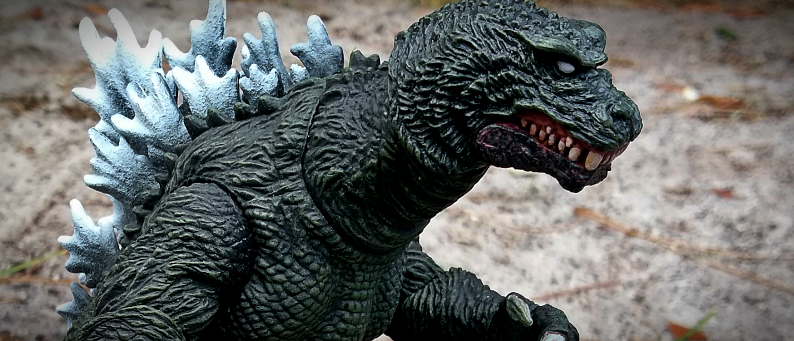
The series' main focus seems to be on Japanese Kaiju characters, including Godzilla, Mothra and Gamera. On a quest to cover each and every incarnation of many beloved creatures, Bandai has finally made it's way to cover the rendition that started it all; ShodaiGoji, from 1954's Gojira.

Released in August of 2016 to coincide with the release of Shin Godzilla, fans were elated at the reveal of such a monumental version of the beloved beast. Costing roughly $70 (and, as of this writing, even less, thanks to a wide release), it's hard not to be drawn toward the true Kong of the Monsters.
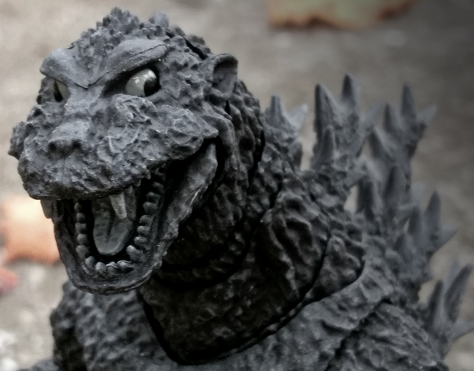
Sculpt - 5/5


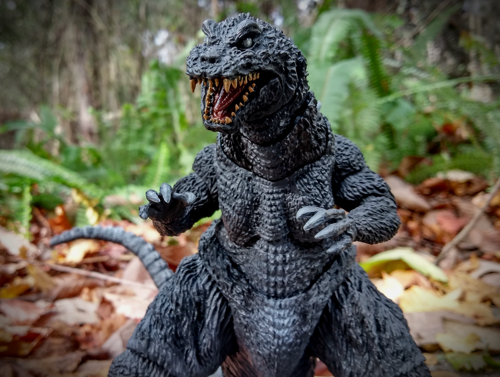
Being the first actual Kaiju suit, ShodaiGoji is quite rough around the edges; with dead eyes, a streamlined build and limited flexibility. At times, the film even used a quite different puppet, causing some inconsistency concerning Godzilla's true 'look' in the film. SHMA's figure has been modelled after the actual suit rather than the puppet, appropriately going for the more refined and popular of the two choices. 

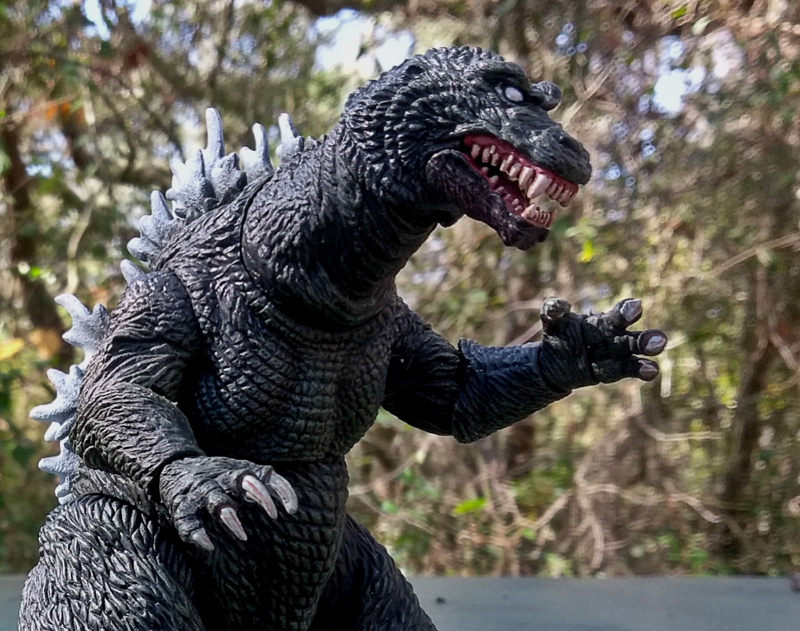
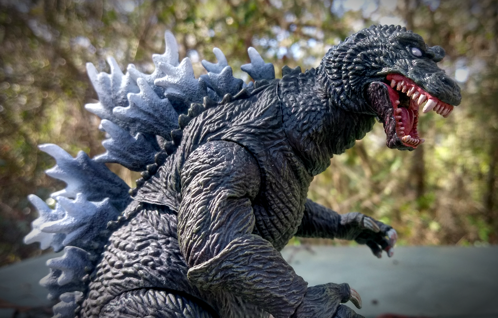
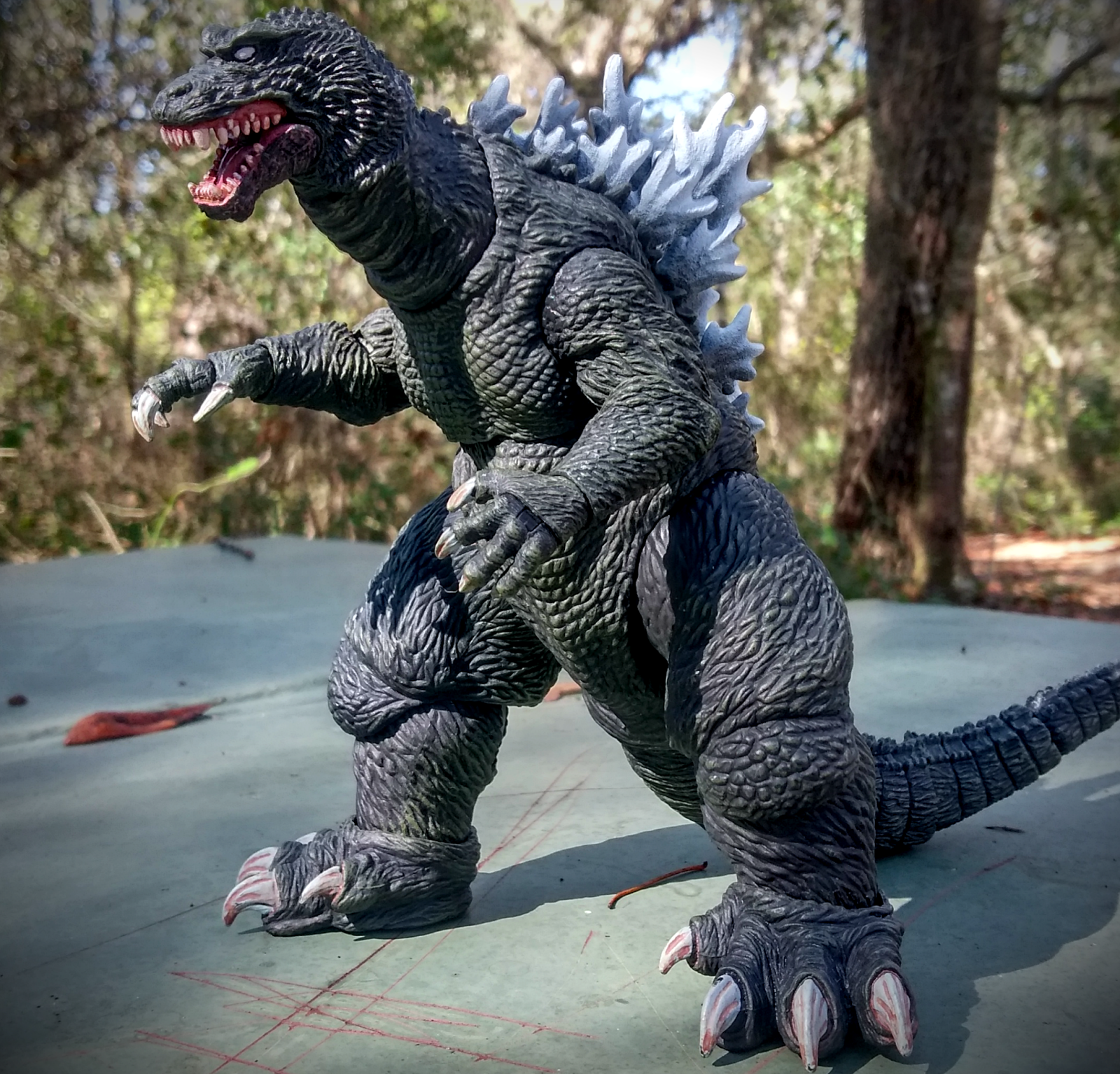
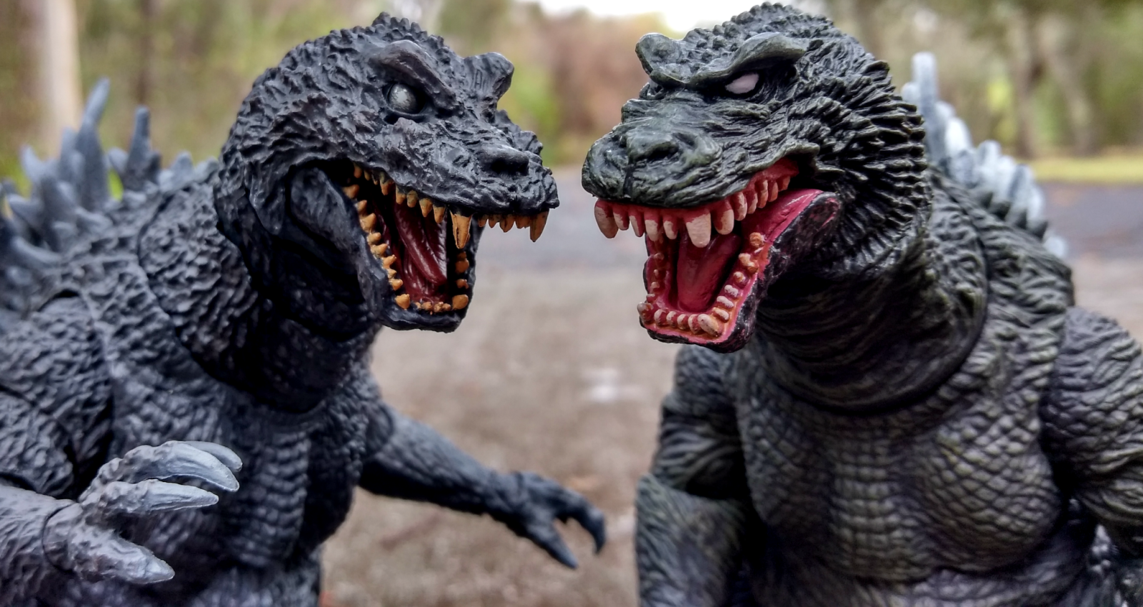
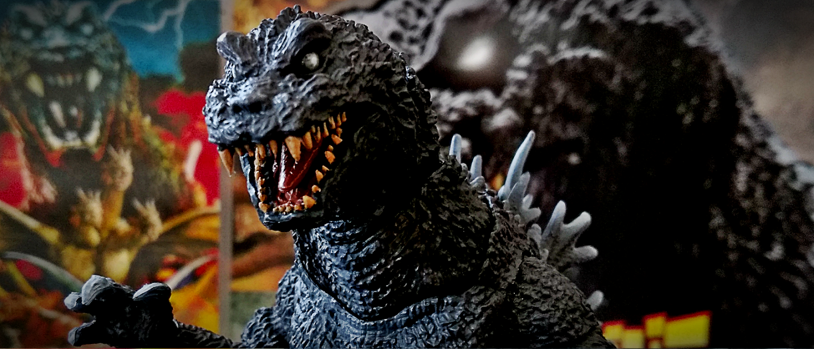
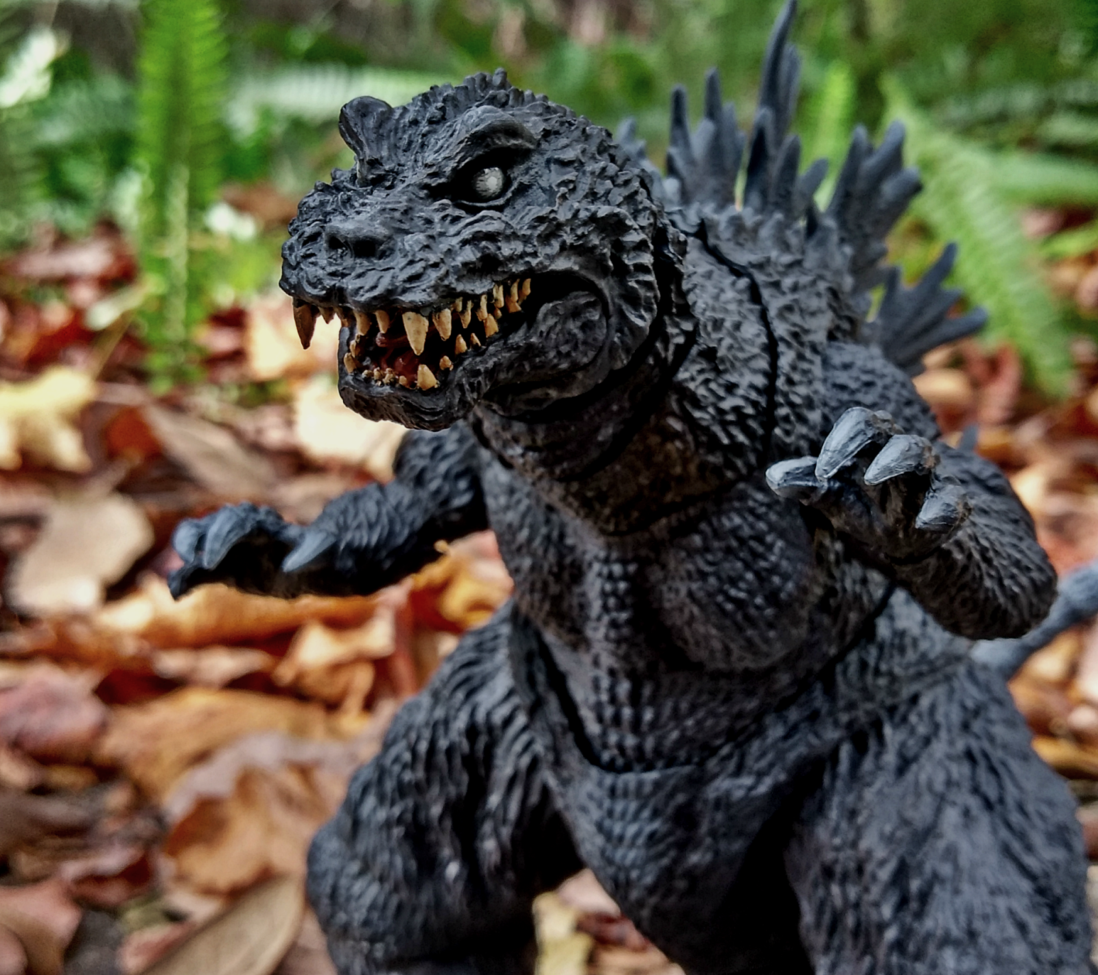
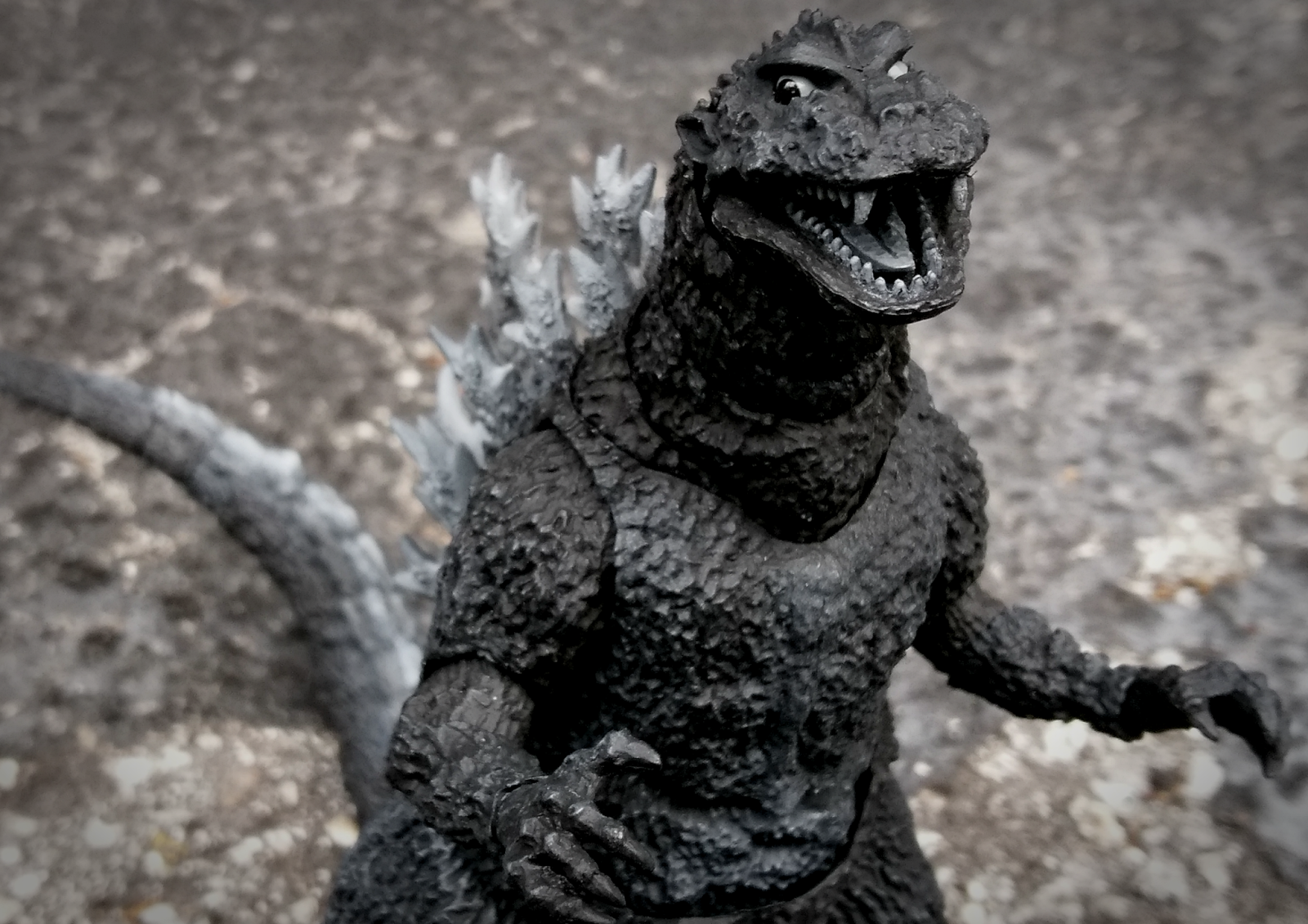
As is practically always, Bandai has struck gold with an incredibly screen-accurate sculpt, down to even the most intricate of choppy textures and natural folds. From the head's strong browline, the jagged dorsal spines, the protruding chest, and even quite hard to notice details such as the stocky tail or large ears, the figure absolutely parallels the original being to a tee. Here's an album of images to compare the figure to.

Being noticeably thinner and smaller than future Godzillas, this figure is about 6.5" tall, but has a much less demanding presence than other characters of the scale. However, being an antiquated version of the character, this fits rather well, and definitely doesn't look out of place. 

Articulation - 4/5


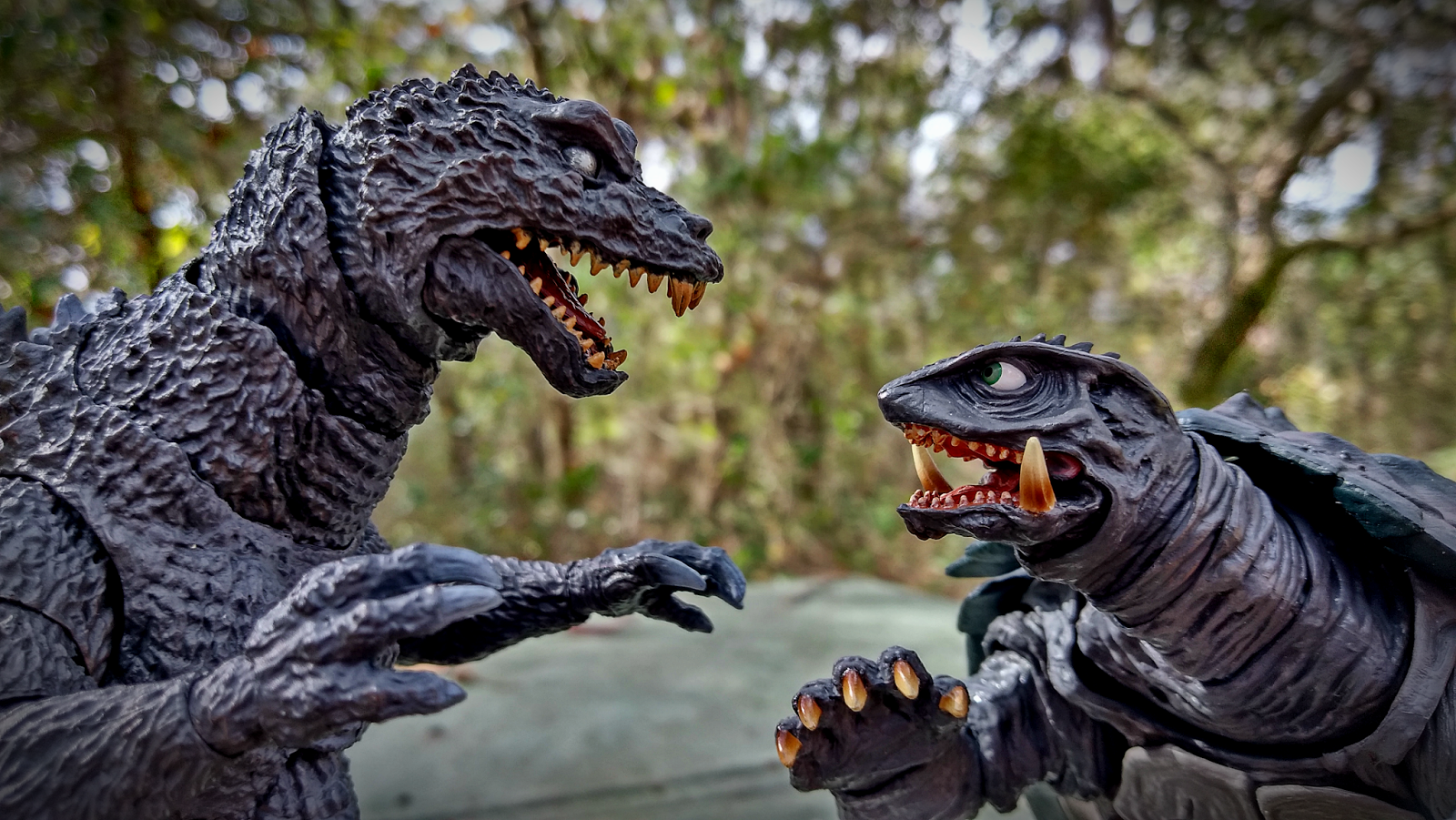
As is usual with the line, this figure is chock full of movements. With about 31 in all, there's some really good range available in the toy; whether you prefer his film-accurate upright stance, or a slightly more dynamic pose, the excellently planned articulation is easily the most striking attribute overall.
However, it should be noted that, while all the typical articulation is there, it isn't nearly as useful as on similar figures. For example, there is a midsection ball joint, but it doesn't exactly allow for much beyond a crunch. Another example is in the arms, which are likewise on a ball joint at the shoulder, but cannot move out to a significant degree. Though not surprising considering the limitations of the design, it's worth acknowledging that despite the sheer number of joints, not everything is incredibly 'free'. 

Paint - 4/5


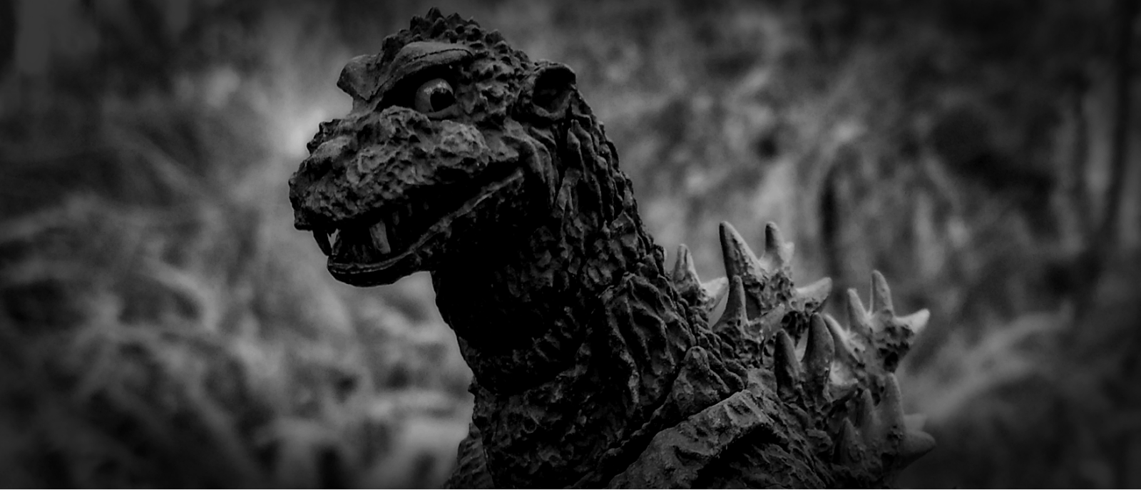
It's difficult to identify precisely how ShodaiGoji ought to be painted; as, naturally, he is extremely obscured by smoke, shadow and general aged film in most source materials. Despite this, Bandai has covered the bases rather well.

Using a monotone color scheme to reflect the original movie, everything looks both nicely 'blurred', and excellent at defining the bumpy ridges of throughout sculpt. Small sprays and washes cover the scales and highlight features such as the heavy knees and vertical chest bone really well, giving dimension to what could've been a very bland toy. The cleaner work on the face is especially nice; as previously seen on SHMA's SokogekiGoji, the glassy eyes look really neat.

A bit more could be asked, such as further/stronger highlights, spray on the hands' claws (though they were unpainted on the real suit), and better alignment of the pupils, but what's there is definitely good. Definitely not among the most incredible or attractive of the series work, but fitting for the character.

Fun Factor - 4/5


SHMA's offering is easily the best articulated ShodaiGoji on the market, with great details and nicely done movability, The monster's design seems to limit how much range one can really get, however, thus meaning he isn't quite as 'elastic' as Godzillas from the same series. No accessories is a big downside, too; especially once this guy hits the aftermarket. He's a cool figure, but perhaps not the most shining model of Bandai's achievements. 

Overall - 4/5


There's a fair amount of things to love in the very first version of Japan's favorite nuclear dinosaur; a spot-on sculpt, pretty nicely done articulation, and traditionally well done detail work. There's certainly room for improvement - and, the complete lack of accessories makes even the lowest of prices seem a little unfair. All things considered, though, longtime SHMA, Action Figure, and Horror fans in general won't be disappointed. 

Tuesday, January 17, 2017

Retro Spirits


I feel so nostalgic for absolutely nothing lately. Not people, not places... moreso things I never had in the first place.

Looking back at images and creations from the 1980's and 90's just brings such a mixed emotion out of me. I never experienced the decades, but I constantly feel so directly related to them. In that sense, I'll never reach a close to my longing for the Pop Cultures and societal normalities of these eras.

I suppose the closest I can reach is delving into these interests retroactively. I'm a huge fan of old characters, particularly those found in advertisements and theme parks... but, knowing that they are now mere memories to those that have endured their love for them makes them a bit sad to enjoy. It's almost akin to reading about the life and times of a long-gone celebrity, or more close to home, relative. You can't help but image how wonderful they must've been, and how greatly you'd have appreciated them, yet there's a deep pit of emptiness in that you'll never prove your belief.

I also simply admire antiquated, yet familiar aesthetics. Outdated webpages, neon cities, bustling homes. Something about them, in my mind, simply cannot exist in my own perceived reality. I reflect it in my tastes and works - for example, Wastelnd's basic, conventionally user-friendly design choices, or my tendency to adorn myself with Mac Tonite or Showbiz Pizza Tee-Shirts - but, again, knowing I simply can't live these names' glory days is so strangely depressing.

Anything from discarded VHS tapes, to long-forgotten albums, to oddball pieces of media, to cheap collectibles, to pandering commercials, to sitcoms, cartoons, stickers, articles... it's practically an addiction. One with no fulfilling payoff.

Yet, in a sense, my personal appreciation of these retro 'spirits' is because of their lack of existence. Their decay, their lessening appeal. It's almost as if I can serve as one of their few life supports.

Maybe they aren't quite passed on, but simply desperate for some love. If that's the best I can do, so be it.

Saturday, January 14, 2017

A Message For Marta (TAS 1000)


Inspiration can come from the strangest of places. Enthralled by the awkward, context-free messages found on a discarded answering machine, Canadian foursome Cass Picken, Scott Howard, Matt Krysko and John Rogers saw potential in what ought to be ignored.  Taking their name from the model of the machine, TAS 1000, and the album's title A Message For Marta from the name of the apparent owner, Marta Leskard, the group melded a musical hodgepodge of creative sampling, genre jumping, and musical prowess.

Released in 2003, the album has remained quietly buried below both the radar, and below the radar's radar, for it's entire existence - it's single dip into popularity coming in Club Penguin precursor, Penguin Chat 3, where catchy intro track 'I've Been Delayed' was used as background music. The album's other songs and skits have been totally lost to irrelevance, known only to those familiar with the aforementioned site's history. Yet, in some sense, the rarity of the album makes it all the more artistically unique; making TAS 1000 as antiquated and rare as, well, a real TAS 1000.

Marta is an eccentric collection of unrelated songs tied together by repetitive, lo-fi vocals, creating a very unique style. Ranging from simple guitar strumming, to bouncy pop beats, to face-blasting synths, TAS has taken this opportunity to prove themselves extremely capable musicians.

Though admittedly lacking a cohesive vibe, the album occasionally does well creating emotion and implication using it's extremely minimal lyricism - a task that ought to be commended, for it's sheer complication. Songs 'Parks Canada' and 'Before You Leave', using almost only one's interpretative skills to meld a sad, longing mood, complementing the mystery shrouding each vocalist and their intentions. While heavily dependant on the sampled words chosen, both serve as prime examples of how sound alone can elicit emotion, using fittingly dreary atmospheres to project the intended feel.

Besides this, most songs are generally nondescript, their artistic and literal meaning both a mystery. The lyrics themselves mean next to nothing; ranging from a complaint about seemingly stolen 'Protein Shoes', to an exacerbating announcement that an unknown caller is now a fully licensed hairstylist. Marta is hardly concerned with capturing a specific overall impact, and instead aims only to deliver a fun-filled jam clearly only driven by what the band really wanted to play. And, it shows - based solely on how filled-out each song is, TAS clearly put their hearts and souls into toying with both an experimental gimmick and finally showcasing their notable skills.

All things considered, the album is a bit loosely formed, though the individual songs are often surprisingly well-made for an album as unknown as this. The repetition can sometimes grow annoying, and some tracks are a bit too plain to make an impact. Though perhaps not exactly underrated - despite their musical work usually being higher end, nothing the album offers is especially new - Marta is totally unrecognized.

Bar one or two other songs and a lost documentary, the album was TAS' only creative foray. Despite being almost undeniably impossible, I'd personally adore further work by the group - Marta is lacking in areas such as cohesiveness, but there's absolutely traces of potential seeping from the record. Far from perfect, but a neat display of a creative idea put to work.


Tuesday, January 10, 2017

These Are Our Children (I Monster)


First released in 1998, I Monster's debut album These Are Our Children is uniquely enigmatic and sonically gripping, painting an eerie picture through it's specifically crafted choices of nostalgic elements; A run-down Jazz bar fogged by a grimy film of smoke, inhabited by ghosts, ghouls, and all reaches of once horrific, but now inoffensively off-putting horrors. Putting aside their tragic longings to be feared once more, the seedy collective of haunts translates their naturally dark, yet morbidly upbeat souls into a jam session full of unnaturally offbeat tunes. 

Though mostly consisting of slow-paced instrumentals dotted with strange samples, bloopy synths, and blaring horn sections, the occasional vocals have a perfected antiquated feel, almost as if copied directly from a long-forgotten record of old. Not unlike later Monster released, there is a 'retro' vibe throughout, what with the use of simplistic musical structures and now-outdated or ignored instruments (such as passé synthesizer settings or nostalgic vocoders). 

The creative freedom is palpable; with one songs sounding not unlike any common Trip-Hop beat, while another is akin to a friendly Haunted Mansion tune, while yet another dips into the inky blacks of dub. However, the general murky inflection of the album never waivers - the dizzy, intoxicated Halloween vibe reaching a striking compendium of sounds in the climax 'Daydream in Blue', a menacing and booming remix of Wallace Collection's 'Daydream'.

Though perhaps unintentionally Lo-Fi, and thus a bit dreary, when Children hits it's love for the decrepit on the head it bleeds with dark creativity, being both classy and gothic in it's blend of inflections. However, the slower dredges of the album can be less than enthralling, and a bit too uniform in their builds. There's an all-too-often ignored difference between a comprehensive sound, and simple repetition of the same style; the latter of which heavily applies to this album.

I Monster's first foray into the world of music is a subdued, yet innovative and unique one; though it has it's variety of faults, which heavily impede the album from successfully playing through it's entirety without boring the listener, one cannot deny the excellent sense of spirit built through the various intentional stylistic choices is an undeniable and strong feature for a group's first effort to boast.

Friday, January 6, 2017

Review - NECA Godzilla 2001


2014 saw a huge revival in Godzilla's fame, and with it came a new toy line from NECA (the National Entertainment Collectibles Association) - a series focused solely on Godzilla's various incarnations through the series' history. Though NECA's work is often of relatively high quality, it seems their Godzillas often highly fluctuate between excellent, acceptable, or just plain bad.

Often, the line is seen as a cheaper, more available alternative to Bandai's coveted S.H. MonsterArts; this view solidified by NECA's choice of producing Godzilla from the 2001 film, "Giant Monsters All-Out Attack", very quickly after Bandai's announcement of the same design (check out my review of that figure here). Released in October of 2016 (though originally intended to come out in July, likely attempting to rival the SHMA offering in sales), he'll cost you roughly $20, depending on the retailer.

Sculpt - 3/5


This design, known as SokogekiGoji, is easily recognizable among the Godzilla's many looks. Having a heavy build, twisted spines, and large feet, he's quite intimidating in and of himself. 

NECA has done a fairly good job capturing the suit's subtleties. Different parts of it's body have different types of scales, ranging from bumps, to ridges, to simple lines. This gives the figure a very pleasing variety of rough textures. The bulky feet and wild spines are nice, and tiny additions such as the small, misplaced teeth and correctly shaped spines show there was a good attempt to remain accurate.

While the little details seem to have been picked up, more upfront issues make them a bit less impressive. First and foremost is the 'off' head sculpt; from some angles it looks somewhat close to the actual suit's, while in others, it comes off as overly cartoony. Big goofy teeth, an over-exaggerated browline, and and ugly underbite do nothing to alleviate this issue. Beyond any accuracy issues, there's also some technical problems, which force the figure into a noticeable hunch, and really limit the articulation. Despite the hunch, he comes in at 6".

Articulation - 2.5/5


With a total of 21 points of articulation, consisting primarily of hinges and double ball joints, one would think there's opportunity for a variety of poses; however, thanks to the aforementioned hunch, it's limited to a very small few. 

The hunch itself has made it so that the ball joint in between Godzilla's upper and lower halves cannot allow for any stance but the forced lean forward. This really neuters how many unique poses the figure can achieve, as even the neck's ball joint cannot move fully upright. Then there's the very bad jaw hinge; not only is it precariously loose on it's pegs, it barely lines up with the rest of the head sculpt.

Everything else is alright, and can allow for some nice poses. As usual with NECA's figures, the end of the tail is a bendable wire. I highly prefer the segmented tails common on SHMA figures, and kind of see this as a cheap choice.

Paint - 2.5/5


Usually, Godzilla consists of primarily monochromatic colors. However, with every release so far, NECA has insisted upon an (surprisingly, to some) inaccurate green wash. Though it looks nice for what it is, it takes even more away from the accuracy.

One will notice in most pictures that the jaw has traces of pink showing through; this is because the jawpiece itself was moulded in pink, and painted over in black. For whatever reason, this has been a consistent issue on this figure, and really makes the head look low quality. The back of the jaw is also entirely unpainted, leaving an odd black abyss at the end of his mouth.

The only outstanding paint work is the spines, which I actually like a bit more than the aforementioned SHMA edition; the spray is very strong, and fades well.

Fun Factor - 3.5/5


He's cheap, he's mostly sturdy, and though he's kind of inaccurate, he makes a fine mass-market figure of this design. The only issue here is that hunch, which cuts off a lot of the toy's potential by keeping poses all pretty similar. Far from being a bad figure when it comes to play, but not as good as it could be all-around.

Overall - 3/5


NECA's Godzilla products have greatly varied in quality, and SokogekiGoji seems to fall squarely in the middle. He's not totally inaccurate, but there's too many things wrong to call him lifelike. The articulation serves it's purpose, but can't do all that it could because of various problems. The paint looks alright on the surface, but falls apart upon inspection; once again, not a poor offering - he's on the higher end of 'middle ground', at least among NECA's figures - but not among the best, either.

It's pretty easy to see the huge differences between SHMA and NECA's versions of the character, and it's safe to say both are serviceable for their price and collector's range. SHMA provides utmost quality for a higher price tag, whereas NECA gives what it can for less. Not a bad trade off, all things considered. 


Tuesday, January 3, 2017

Review - S.H. MonsterArts Godzilla 2001

Before we begin, my judgement scale is a simple out of five scale; one being worst, five being best. This scale will apply to all reviews.


Godzilla is one of the few franchises that has, through parody, rejection and failure, truly stood the test of time. Whether thanks to the simplicity of the concept, or the human nature to adore the morbid, the creature has consistently stood firmly in pop culture since his inception.

Much of this is thanks to film's closest and truest friend; marketing. You'd be hard pressed to find a modern toy company that hasn't dabbled with the Japanese Giant - Hasbro, Mattel, Funko, Toynami... the list could go on and on.

Though, one has always seemed to take the forefront as the primary, most cohesive producer of plastic gargantuans - Bandai. With their renowned - though rather expensive - S.H. MonsterArts line, the company has brought to life countless Kaiju characters, with an impressive mix of stunning sculpts and intricate articulation. One of the newest additions to the series is Godzilla's 2001 design known as SokogekiGoji , from the film "Giant Monsters All-Out Attack!". He'll cost you about $80, and was released in July of 2016.

Sculpt - 5/5 


SokogekiGoji is one of the more unique designs from the Godzilla series, intended to communicate a possessed, zombified reincarnation of 1954's popular first look at the beast, ShodaiGoji. Though not a carbon copy of this design, much of the general inflections (such as a monotone choice of coloration, a heavier build, etc) are carried over.

Bandai's famed sculpt work has not fallen short; every scale, bump, and fold has been artfully captured, down to even the smallest detail. It's truly amazing how closely the figure matches the real deal; here are some shots of the suit to compare to.

This particular suit was among the tallest in the series' long history, standing over seven feet tall. Surprisingly, this is reflected by the figure itself; the typical Godzilla figure from this line is roughly 6"-6.5" inches tall, though 2001 is easily at 7" in most poses. Though light, the figure has a good bulk to it that gives it a demanding presence among other figures.

Articulation - 5/5


One of the key features of SHMA that puts it above other high-end companies is the highly integrated articulation. 2001 has carried on the necessary tradition, and with flying colors.

There are approximately 37 points of articulation, most of which are double-ended ball joints. The range of poses is absolutely incredible, as is common with this particular line; I especially enjoy the highly poseable tail, which, thanks to having a ball joint hidden inside each of the tail's segments, flows naturally and has almost no limits. 

A common issue consumers have had is with parts popping out of their joints upon even the lightest touch; though the very tip of the tail and the left hand have fallen off of my model, nothing else has fallen off.

Paint - 3.5/5


It's often hard to fairly judge the paint work on figures of Godzilla himself, simply because - bar some few and far between cases - he typically only consists of a few very plain colors. 

However, Bandai has once again done well with such little work necessary. moulded in light black, the figure is covered in various tones of grey. The soft spray on the spines, nails and various parts of the chest looks very nice; I especially like the work on the large feet, which has a very nice fade. I've seen some complaints that the spines are a bit underpainted, but depending on which still from the film itself one looks at, they could be argued as accurate. I feel they could have used a bit more white along the tips, but they don't look bad without it.

There is a very minor brown wash on the figure, and though I imagine it would've given the sculpt even more definition if properly applied, the actual results seem to have clumped into random places on most figures. Mine has clumped onto the lower neck segment, and is not present anywhere else on the figure's surface; I'd liked to have seen this dusty color used correctly, as it could've helped the overall appearance match even closer to the movie.

The face itself is both good and bad; the design's unique blank-white eyes have a well-done fade to black, and a very attractive gloss; if I didn't know any better, I'd think they were fully glass. The mouth, however, is pretty underwhelming. The tongue and insides have a simple, but adequate deep red wash to them, but the teeth are very one-tone and cheap in appearance. There is a noticeable gap between each tooth and where his gums should be, but this is left fully unpainted. 

Fun Factor - 5/5


Though SHMA is inarguably a collector-centric line, the sheer amount of articulation on their figures make them a lot of fun to fiddle with. SokogekiGoji is chock-full of movement, and thus, is really hard to set down in just one pose. His lack of accessories is a bit of a shame, but the figure makes up for it in quality.

Overall - 5/5


Though certainly not the best figure in SHMA's lineup, there's very little actual qualms to be made concerning this figure; my biggest issue is with the cheap paint work, but standing on your shelf, it's hard to notice these issues at all.

The price tag is a bit steep (as is common for Japan's high-end figures), especially seeing as he is a bare-bones release, but I personally feel that - once again - the overall artistic quality of the toy makes up for it. 

I hope that, sooner or later, SokogekiGoji's foes (Baragon, Mothra and King Ghidorah) are added to the SHMA line, giving the figure some worthy adversaries. Until then, SHMA's Gamera of "Gamera 2 - Attack of Legion" (headed by the same director that brought us "Giant Monsters", Shusuke Kaneko) fits in nicely.

All-in-all, the weaknesses of the figure don't bring down the strengths; Godzilla 2001 is certainly a must-have.

Monday, January 2, 2017

A Warm Welcome


I've considered a blog, or at the very least, a means of simple, direct, yet expressive output for a long time. I often feel a desire to share my interests, my ideas - yet, at the same time, I never feel a special relevance with or without my opinions being held on a marble pedestal.

It's that focus on irrelevance that I think many a modern person experiences; in a world of fame defined by digitally registered numbers, being one of the mere digits is inevitable - and inescapable. Being just one small voice is the nature of the medium, a vast blank slate on which the entire world may paint. And it is as freeing as it is confining.

However, as upsettingly vast the Web can be, it has niches. One small link can reveal an entire ecosystem of people, people eerily similar upon close inspection. Small beings in the form of communities, often with similar links; one thing leads to another. One interest often indirectly correlates to hundreds of others.

And that, in and of itself, can describe what I expect to come of this blog. Not one overarching theme, not one direct mission - instead, a compendium of my indirectly related interests. Death leads to life, which leads to society, which leads to individual people, which leads to interest, which leads to thought - which has far too many facets to list. However, I more or less feel I can shed light on my own versions of these facets through these various writings.

I will openly admit to being a natural child of modern life. I don't find myself to be on a specific mental level above the vast majority of the world, and nor do I wish to achieve that goal; I love the trash of humanity. The effortless, and pandering. The worlds of corporate color that are designed only to rake in countless figures of cash.

Though, to keep this introduction relatively short - I also do find myself capable. I have a deep personal interest in the lighter, mindless side of the world, yet I dive much too far into these areas for my own good. A nearly obsessive drive digs for analysis, and this drive is really quite inescapable. Not as a pestering annoyance - but as a seemingly ingrained reaction.

As sardonic as it naturally comes off, I don't expect a reader base; I don't need my words to be seen as code. As I've lived, I've realized not to expect existence to magnetize itself to my doing - as, after, all, who's to say that 'existence' itself is real? Instead, it is best to grab existence by the throat, and take all that is has.

Er-- that's a little dark. How about, grab existence's hand and playfully jaunt through a springtime park. That's nice.

Originally posted January 1st, 2017